GITHUB README / FORMATTING GUIDE
How to Add ASCII Art to a GitHub README
To add copy-paste ASCII art to a GitHub README, keep the project name in normal Markdown and put the decorative banner inside a fenced text block. This guide gives the exact template, a practical width limit and the generator for making a banner that stays readable on smaller screens.
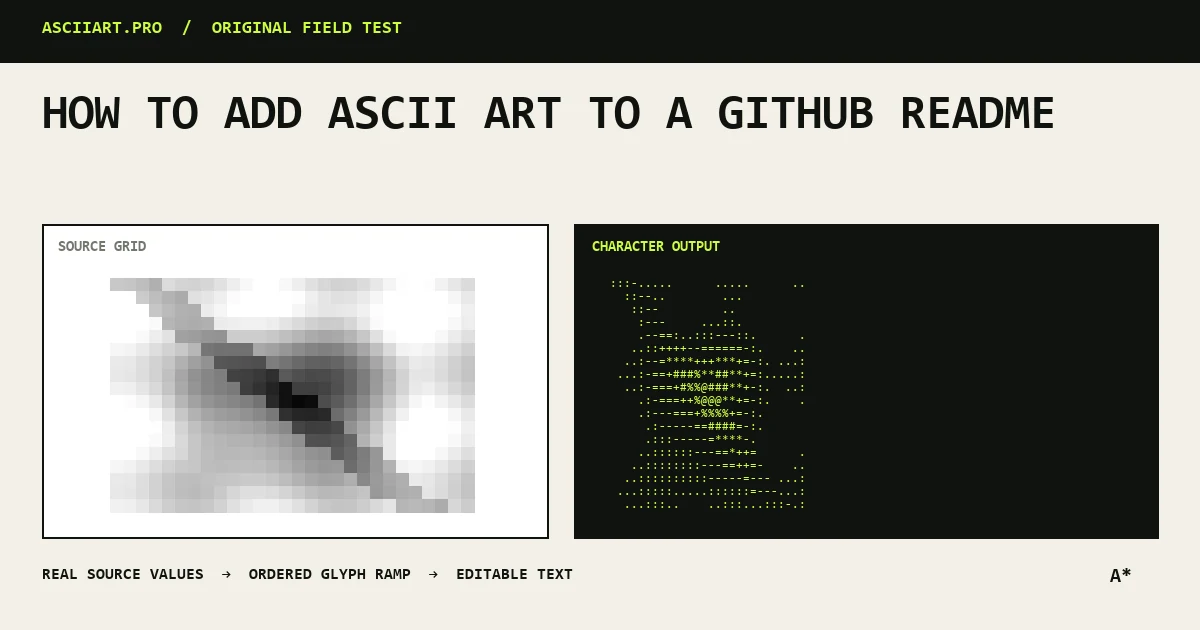
Generate a short project banner
Short names are easier to recognize and far less likely to wrap. If the repository name is long, use an abbreviation or place a smaller subtitle underneath the banner.
A banner should support the repository title, not replace the normal Markdown heading that search engines and assistive technology can understand.
- Keep the main word under 12 characters
- Retain a normal H1 heading
- Avoid decorative noise around the name
Use this copy-ready README structure
Keep the real project name and description in ordinary Markdown, then place the decorative banner inside a fenced text block. Replace YOUR ASCII BANNER with output from the GitHub README ASCII generator.
The text label after the opening fence is optional, but it prevents programming-language syntax highlighting from coloring the artwork.
# PROJECT NAME

A one-sentence description of what the project does.

```text
YOUR ASCII BANNER
```

## Installation

Add your setup instructions here.Use a fenced code block
Wrap the output in three backticks and optionally label the block as text. GitHub then preserves spaces and renders the result with a monospace font.
Do not indent the art with tabs. Tab width can change between editors and will make the banner drift out of alignment.
Design for repository width
A practical README banner stays around 60–80 columns. GitHub can horizontally scroll wider code blocks, but visitors on phones may see only the left side.
Check the rendered README rather than relying only on your code editor. Font metrics and container width differ.
- Target 80 columns or fewer
- Preview the repository page
- Test a narrow browser window
Text banner or image export?
Plain text is searchable, editable and theme-independent. A PNG offers exact layout and color but adds an asset request and may look wrong in dark mode unless the background is transparent.
For most developer tools, start with text. Use a transparent PNG when the branding needs a specific color or a very complex image conversion.
Keep the README accessible
Screen readers may announce character art as punctuation. Put the meaningful project name and description in normal text before the decorative block.
If the art conveys information rather than decoration, explain that information in the surrounding paragraph.
Quick answers
How do I put copy-paste ASCII art in a GitHub README?
Keep the project title as normal Markdown, then put the artwork inside a fenced text block. This preserves spaces and prevents programming-language highlighting from changing the banner.
Why is my ASCII banner misaligned on GitHub?
It is usually outside a fenced code block, contains tabs, or is too wide and wrapping in a narrow container. Use the text fence shown above and replace tabs with spaces.
Should ASCII art replace the README title?
No. Keep a normal Markdown heading and treat the art as a decorative companion.