MOBILE DISPLAY / TROUBLESHOOTING
How to Keep ASCII Art Readable on Mobile
Mobile does not usually break the character grid itself; it exposes designs that are wider than the available container. Width is the first setting to fix.
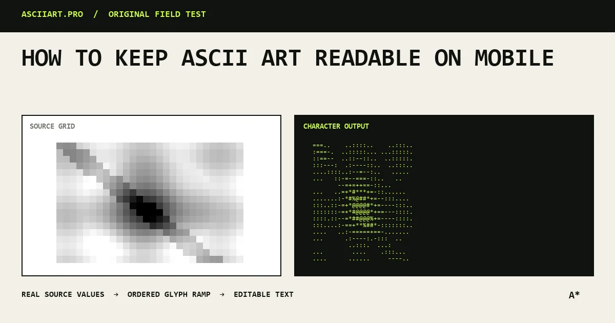
Design below the wrap point
For chat and social apps, begin around 30–50 columns. A code block may scroll horizontally, but a fully visible silhouette is easier to understand.
Use the density control to regenerate a narrower result rather than deleting characters by hand.
Protect preformatted text
Use code blocks or preformatted containers that preserve spaces and disable wrapping. If horizontal scrolling is allowed, make it obvious rather than letting lines wrap unpredictably.
Avoid tabs and trim-resistant invisible characters.
Check touch and copy behavior
Large preformatted blocks can be difficult to select on a phone. Provide a dedicated copy button so the complete leading whitespace is captured.
Keep nearby buttons large enough to tap without scrolling over the artwork.
Use an image fallback
When the platform controls typography or wraps every long line, a responsive PNG is the dependable format. Include descriptive alt text and keep the text version available when useful.
Preview both portrait and landscape orientations before publishing.
Quick answers
How many columns work on mobile?
Around 30–50 columns is a practical starting range for chat and narrow content areas.
Why does code formatting still scroll?
Code formatting preserves the grid but cannot make a wide design fit a narrow viewport. Reduce density or use an image.