MONOSPACE FONTS / SELECTION GUIDE
Best Monospace Fonts for ASCII Art
Monospace guarantees equal advance width, but it does not guarantee equal visual density. Stroke weight, line height and Unicode coverage all change the appearance of the same art.
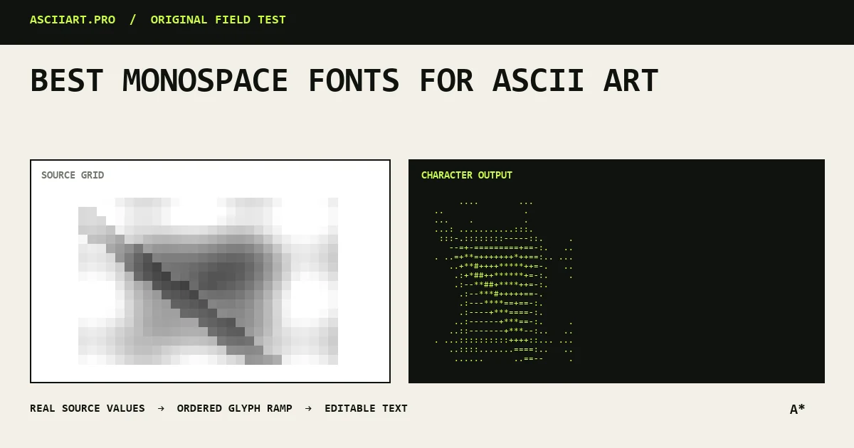
Prioritize regular cell metrics
Choose a font where punctuation remains visible and vertical alignment is stable. Very narrow or highly stylized coding fonts can make gradients uneven.
Use normal font weight first; bold text changes the effective density of every ramp character.
Check Unicode coverage
Classic keyboard ASCII works in almost every monospace font. Blocks, box drawing and Braille require broader Unicode support.
Missing glyph fallback can silently mix a second font with different metrics, bending part of the image.
Control line height and letter spacing
Set letter spacing to zero and use a compact, consistent line height. Extra line spacing stretches an image vertically even when columns remain correct.
For image conversion, character aspect compensation should match the actual font and line height.
Test in the real destination
Consolas, Menlo, Monaco and common system monospace stacks are practical starting points, but the destination may substitute another font.
If exact presentation matters, export PNG after selecting the font rather than relying on the viewer's environment.
Quick answers
Is every monospace font equally good for ASCII art?
No. Equal cell width preserves alignment, but glyph density, line height and Unicode fallback still change the image.
Should I add letter spacing?
Usually no. Extra letter spacing breaks the intended grid proportions.