IMAGE CONVERSION / PRACTICAL GUIDE
How to Convert an Image to ASCII Art
Good ASCII conversion is less about pressing a button and more about matching the source image to the limits of a character grid. This guide explains the controls that make the largest visible difference.
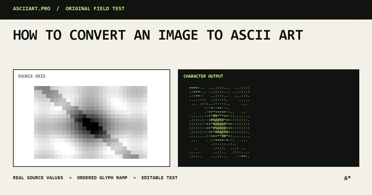
Start with a readable source
Images with one clear subject, a simple background and a useful range from dark to light translate most reliably. Tiny details that are smaller than one output character disappear, so crop tightly before converting.
Portraits usually improve when the face fills most of the frame. Logos benefit from high contrast and a plain background.
- Crop around the subject
- Prefer clear edges over fine texture
- Use a larger original when possible
Choose the output density
Density controls the number of text columns. More columns preserve detail, but create wider output that may wrap in chat or documentation. Fewer columns produce a stronger, poster-like silhouette.
Text characters are usually taller than they are wide. A converter must compensate for that aspect ratio or the result looks vertically stretched.
- 28–50 columns for chat
- 50–80 for README files
- 80–110 for detailed exports
Balance brightness, contrast and gamma
Brightness moves the whole image toward light or dark. Contrast separates neighboring tones. Gamma changes the middle tones without moving the darkest and lightest points as aggressively.
Adjust one control at a time. First make the subject recognizable with brightness, then separate it from the background with contrast, and finally use gamma to recover facial or shadow detail.
Pick a character ramp
A glyph ramp orders characters from visually dense to visually light. A classic ramp such as @%#*+=-:. gives smooth shading, while blocks create bolder shapes. A short custom ramp creates a graphic, poster-like effect.
Ordered dithering deliberately varies neighboring character choices. It can reveal gradients in skies and faces, but may add distracting texture to logos or line drawings.
Export for the destination
Copy plain text for terminals, code blocks and messages. Use TXT when whitespace must remain intact in a file. PNG is safer for social platforms that do not preserve monospace alignment.
Before publishing text output, preview it at the destination width. A beautiful desktop result can become unreadable after mobile line wrapping.
- Text for editable, lightweight output
- PNG for predictable visual layout
- Transparent PNG for compositing
Quick answers
Why does my ASCII image look inverted?
The source and destination may use opposite light backgrounds. Toggle luminance inversion or switch the preview background.
Does a higher density always look better?
No. Higher density preserves detail but can weaken the overall silhouette and makes the output harder to paste into narrow spaces.