GLYPH SYSTEMS / COMPARISON GUIDE
ASCII Art vs Unicode Braille Art
Classic ASCII and Unicode Braille both build images from text, but they solve different problems. ASCII emphasizes compatibility and recognizable character texture; Braille emphasizes compact detail.
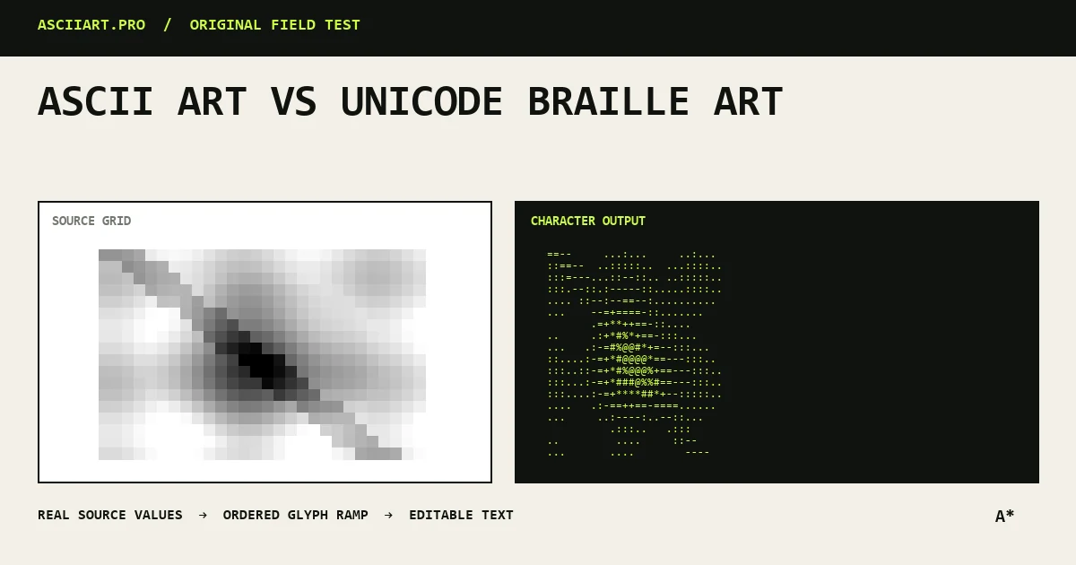
What classic ASCII does well
Classic image conversion maps brightness to familiar keyboard characters such as @, #, *, colon and period. Dense characters represent dark areas and lighter characters represent highlights.
The output is easy to edit and works in old terminals, source files and plain-text systems.
- Broad compatibility
- Recognizable retro texture
- Easy custom character ramps
Why Braille looks more detailed
Unicode Braille symbols contain a matrix of dots inside each character cell. That lets a converter suggest smaller features with fewer visible characters.
The result can look smoother at the same column width, especially for portraits, line work and high-contrast images.
Compatibility differences
Braille requires a font with good Unicode coverage. Most modern browsers and terminals support it, but the exact dot weight and spacing vary.
Plain ASCII is a safer choice for legacy systems, code comments and environments where the font is unknown.
Choose based on the destination
Use classic ASCII for terminal identity, README banners, retro visual texture and maximum portability. Use Braille when you need more image detail inside a narrow text block.
For social platforms that use proportional fonts, export either style as PNG rather than relying on pasted alignment.
- ASCII for portability
- Braille for compact detail
- PNG for fixed presentation
Treat both as different materials
There is no universally better glyph system. The source image, output size, font and destination determine the result.
Try both at the same density, then compare the silhouette before fine-tuning brightness and contrast.
Quick answers
Is Braille art technically ASCII art?
It uses Unicode rather than the original ASCII character set, but it belongs to the broader family of text and character art.
Why does Braille art look different between devices?
Fonts draw Braille dots with different weight, spacing and alignment, so the same text can vary slightly.