LOGO CONVERSION / SETTINGS GUIDE
How to Turn a Logo into ASCII Art
Logos need a different conversion strategy from photographs. The goal is not maximum tonal detail; it is a recognizable silhouette that survives a small character grid.
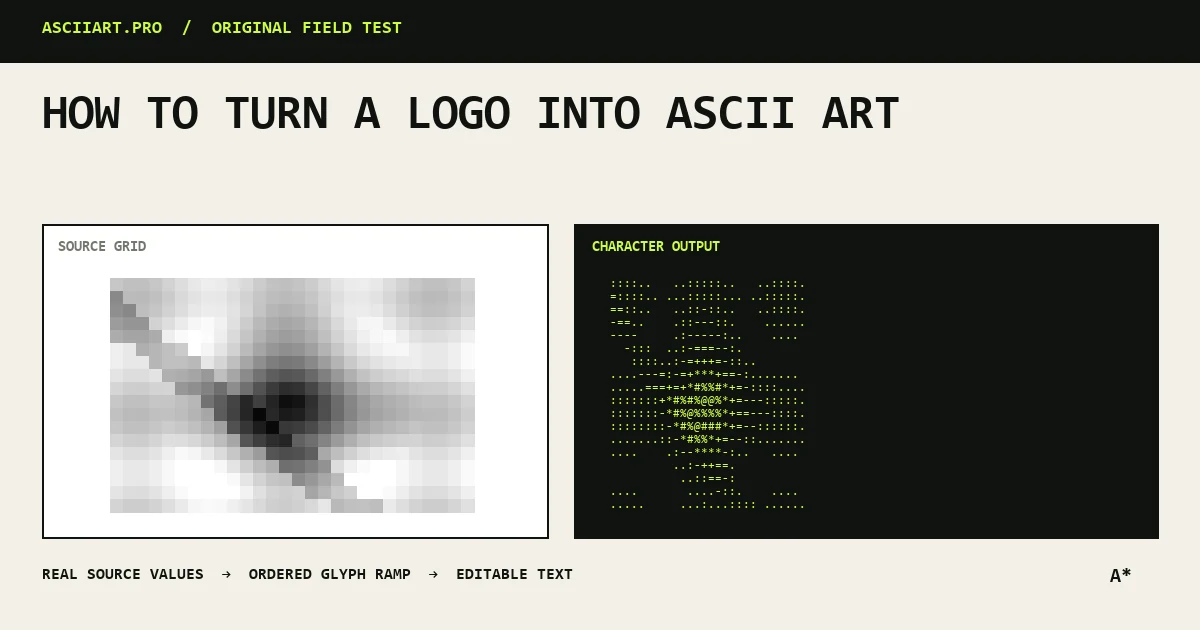
Prepare a clean source
Use a high-resolution logo with a flat background and generous padding. Remove taglines and tiny registration marks unless the output will be extremely wide.
A single-color mark is ideal. If the logo uses gradients, create a high-contrast version first so the outline remains identifiable.
Use fewer glyphs
A short ramp such as @#:. or █▓░ creates clear edges. Long ramps are useful for photos but can turn a logo into noisy shading.
Start near 50 columns and increase only when an essential feature is missing.
- Short ramp
- No dithering at first
- Strong contrast
- Tight crop
Test positive and reversed versions
A logo designed for a light background may need luminance inversion on a dark terminal. Export both versions instead of assuming one will work everywhere.
Transparent PNG is best for fixed brand color. Plain text is best for README files and terminals that change themes.
Judge recognition at a glance
Step away from the character texture and look at the overall shape. If the mark is not recognizable at normal reading distance, reduce detail rather than adding more.
Keep the original brand name in normal text near the art for accessibility and search visibility.
Quick answers
What character ramp is best for logos?
Start with a short high-contrast ramp such as @#:. or block characters, then add tones only if the logo contains meaningful shading.
Should I enable dithering for a logo?
Usually no. Dithering can roughen clean edges; reserve it for logos that intentionally use gradients.