DITHERING / VISUAL EXPLAINER
ASCII Art Dithering Explained
Dithering creates the impression of an intermediate tone by alternating nearby character densities. It can recover smooth gradients, but it also introduces visible texture.
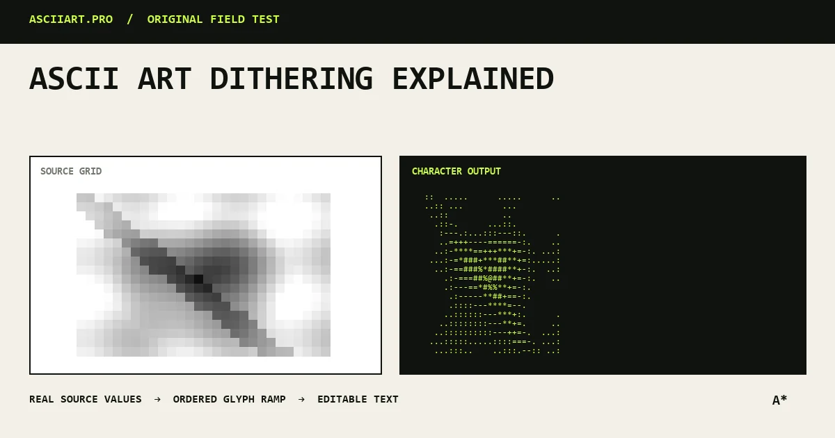
Why banding appears
A converter has fewer glyph tones than a photograph has brightness values. Similar pixels are forced into the same character, creating flat bands in skies, skin and soft shadows.
Increasing ramp length can help, but only if the font makes each step visibly different.
How ordered dithering works
Ordered dithering applies a small repeating threshold pattern before selecting a glyph. Neighboring cells alternate between lighter and darker characters, so the eye blends them into a middle tone.
The pattern is deterministic, which makes exports stable and avoids random flicker.
Where it helps
Use a low to moderate amount for portraits, gradients and hazy backgrounds, especially when the output width is limited.
Turn it down for logos, typography, line drawings and already noisy photographs.
- Good: faces, skies, soft lighting
- Usually bad: logos, diagrams, text
- Check at actual output size
Tune it after contrast
First establish a readable silhouette with brightness, contrast and gamma. Then add dithering only to recover missing transitions.
If the output looks grainy, reduce dithering before reducing density; the underlying shape may already be correct.
Quick answers
Does dithering add more detail?
It adds the perception of intermediate tones, not new source detail. It is most useful when tonal banding is the problem.
Why does my logo look noisy with dithering?
Ordered texture interrupts clean edges. Disable it or use a very low amount for flat graphic sources.