CHARACTER RAMPS / REFERENCE GUIDE
The Best Character Ramps for ASCII Art
A character ramp is a palette ordered by visual density. Changing the ramp can alter an image as much as changing brightness or contrast.
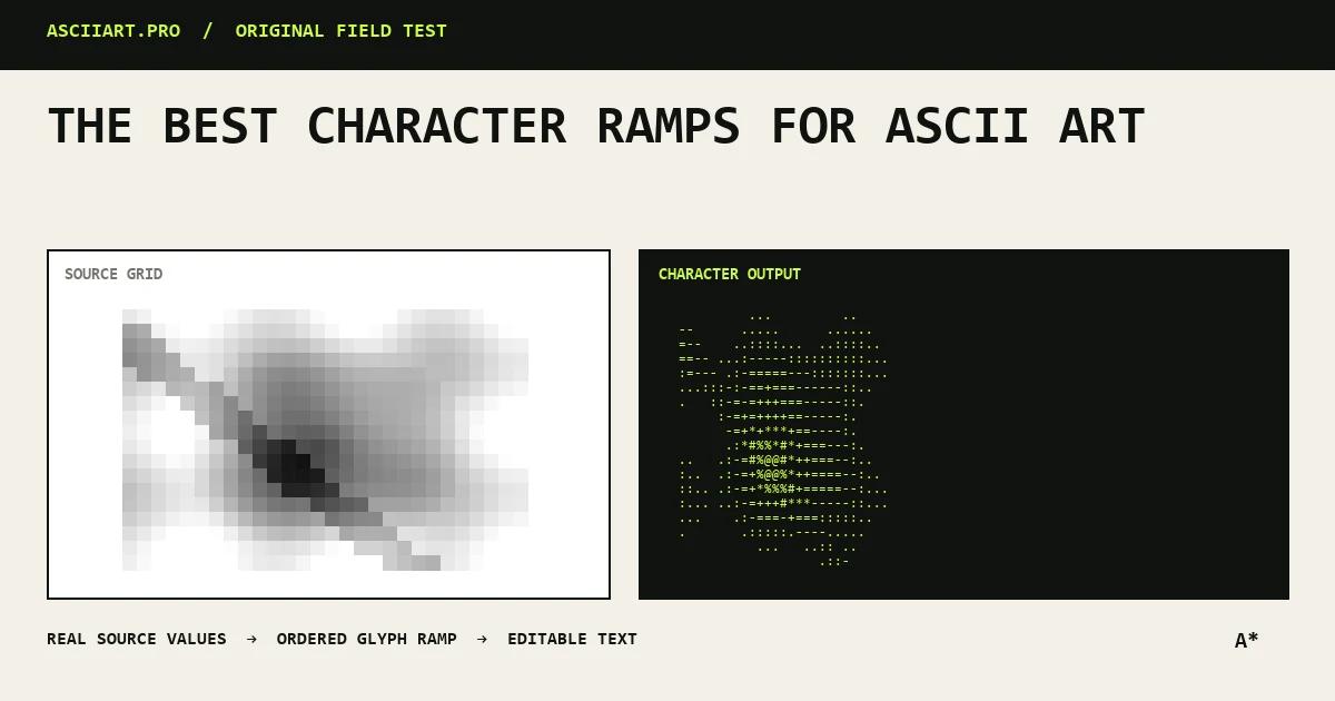
Start with a balanced general ramp
For photos, use characters that move gradually from solid to sparse: @%#*+=-:. . Each step should look lighter than the one before it in the font you intend to use.
Repeated or visually similar glyphs add little information and can create banding.
Use short ramps for graphic work
Logos, icons and poster effects benefit from three to five tones. @#:. creates a crisp keyboard look, while █▓▒░ creates smoother blocks with less punctuation texture.
Short ramps exaggerate shape and hide noise, which is often desirable at low density.
Match the ramp to the font
A character is not equally dense in every font. A thin @ in one typeface may be lighter than a bold # in another.
Preview the ramp in the destination font and reorder it if the gradient appears to reverse or jump.
Build a custom visual voice
Custom ramps can use letters, symbols or a limited motif, but the density order still matters. Repeating a brand initial can work for a poster export even when it is unsuitable for plain text.
Save named presets for repeatable output instead of rebuilding the ramp for every image.
Quick answers
Should a ramp go dark to light or light to dark?
Either works if the converter knows the order. In ASCIIART.PRO, enter dense characters first and sparse characters last.
How many characters should a ramp contain?
Three to five is strong for logos; eight to twelve gives smoother photographic shading.